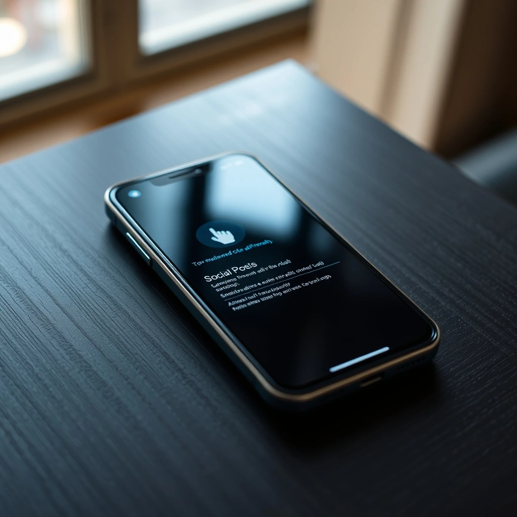
- The Trigger: A sudden UI update introduces a pointing hand icon directly beneath user posts.
- The Confusion: Creators report accidental clicks and constant pressure to monetize casual thoughts.
- The Strategy: Platform monetization aggressively blurs the line between organic and paid content.
Open your feed today and you will likely spot a strange new guest sitting right below your favorite posts: a literal pointing hand. Let's be candid: platform interfaces change constantly, but this latest visual nudge feels entirely different. It is pushy, unexpected, and frankly, deeply confusing for anyone just trying to share a casual thought.
The Anatomy of an Accidental Click
Interface design used to be subtle. Buttons faded into the background until you needed them. Not anymore. The new pointing hand icon on X practically demands your attention. Placed squarely in the action row alongside replies and reposts, it invites everyday users to throw cash behind ordinary updates.
Naturally, muscle memory is working against us. People used to tapping near the center of the post metrics are suddenly finding themselves staring at payment screens. Here is what we are seeing across the board:
- Frequent accidental taps during routine scrolling sessions.
- Sudden prompts asking for credit card details for casual status updates.
- Growing frustration among long-time users who feel nickel-and-dimed at every turn.
Monetizing the Mundane
Why push paid promotion on a grocery list or a blurry photo of a pet? The economics of modern social networks rely entirely on continuous transaction velocity. By lowering the friction between an ordinary user and an ad buyer, the platform turns every single participant into a potential revenue stream.
Think about how aggressive this shift is. Traditional advertising required an intentional detour into a business manager dashboard. Now? It is baked directly into your daily scroll. One wrong thumb movement and your breakfast thoughts are suddenly primed for a budget allocation.
Always double-check your tap targets before interacting with standard posts. If you accidentally trigger the promotion window, do not panic—simply back out of the payment screen without saving any financial details to your account profile.
The Blurring Lines of Organic Reach
When every post carries a subtle invitation to pay for views, organic reach starts to feel artificial. Users no longer know if a post is gaining traction because of merit or because someone threw twenty bucks at the algorithm. This erodes the fundamental trust required to keep a community healthy.
Let us look at how this changes the daily experience:
| Aspect | Traditional Approach | Modern Solution |
|---|---|---|
| Visibility | Earned through engagement | Accelerated via direct payment |
| UI Placement | Hidden in separate menus | Embedded in primary action bar |
| User Intent | Deliberate ad creation | Accidental prompt conversion |
How to Navigate the New Interface
Adapting to aggressive UI changes requires active vigilance. You cannot rely on muscle memory anymore. Take a breath before tapping, examine the icons carefully, and refuse to let dark patterns dictate your spending habits.
Platforms will keep testing the boundaries of what users accept. When a pointing hand tries to direct your wallet, the best response is quiet awareness and careful navigation.
Frequently Asked Questions
Can I disable the pointing hand icon on my posts?
Currently, there is no toggle or settings switch to remove the promotion prompt from your interface. It is a permanent fixture of the current layout update.
Will my post automatically publish as an ad if I tap it by mistake?
No. Tapping the icon opens the promotion menu, but you must manually enter payment information and confirm the ad spend before any money leaves your account.